I have been completely overtaken by my newest project: making over my new Prague apartment!
When I arrived in Prague, I was lucky to have an apartment waiting for me — the apartment my boyfriend Charlie has lived in for the past ten years, the apartment for which I’ve been on the lease for more than a year.
Merging two households is a tricky dance in the best of times. You balance different sets of lifestyles and needs, and you need to decide what to keep and what to get rid of.
It gets more challenging when there are disparities between partners: one who speaks the language all the furniture websites are published in, and one who speaks none; one who is crazy obsessive about decor, and one who isn’t into decor much.
Charlie hasn’t done any decorating since he moved in 10 years ago. But over the years the apartment has turned into a bit of a coworking space for his local friends and colleagues, so the place is dominated by desks and monitors and office chairs, even in the bedroom. It’s essentially a bachelor pad — not in a dirty way or a skeevy way, but just a simple place that could use some updating.
Luckily, Charlie is excited for us to redecorate the place. He’s even more obsessive than I am in some categories, like countertops and lighting!
I wrote this post so I can show it to you as the “Before” that comes before the “After.” Making the apartment over will be a long-term process, especially because we’re doing it on a budget, and I’ll be updating you when we finish a new project.
But first, let’s take a look back.

Let’s look back at my New York apartment…
Honestly, as much as I loved living in a pulsating city like New York, the absolute best part was living in my own apartment! It was my first time living alone, and for four years I got to enjoy blissful solitude and be in charge of absolutely everything.
Coming in from my long-term travels, I started with no furniture. That gave me a chance to build it up from scratch and be thoughtful in each piece I selected. I had a living room full of color, complete with bright pink rug and rainbow bookshelves, but also a bedroom that was white and gray with hints of gold and champagne silver, like a rainy day. The kind of day that invites you to burrow under the covers.
I obsessed over my apartment. And I definitely spent too much money at West Elm. But I’m really happy with how it all came out.
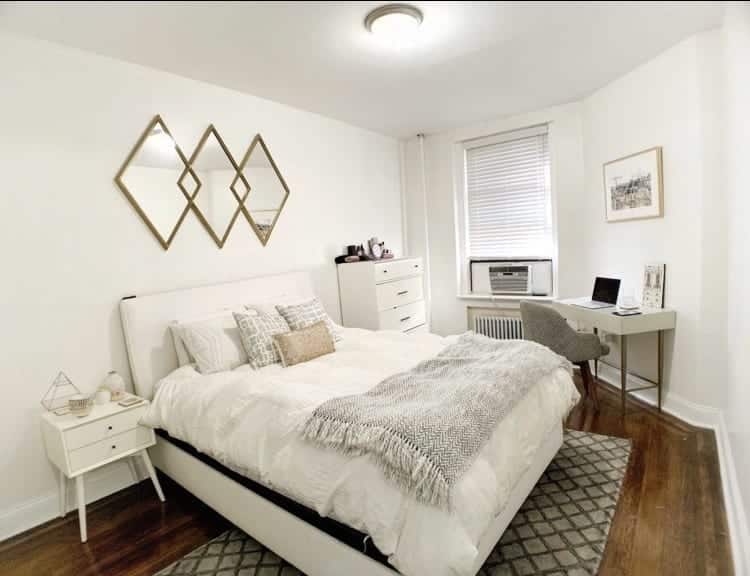

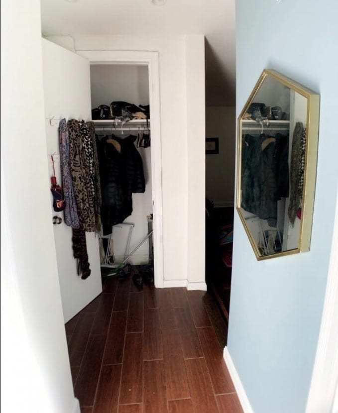
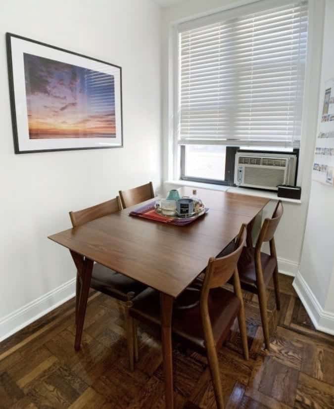
I loved my apartment SO much. And it did break my heart a bit to leave it.
I sold a lot of my belongings. The dining set. The bookshelves. Lots of framed art. The mirrors, those glorious mirrors.
But having this apartment showed me that having a place you love can do SO much for you mentally. Your home is your sanctuary. It should be a place that brings you joy just being there, sitting on the couch with a book and a cup of tea. And you don’t necessarily have to spend a ton of money to create a place that makes you feel that way.
Meet the Prague Apartment
Our Prague apartment is wonderful, and so much like the city of Prague in its grandeur and quirkiness. It’s a large and airy one-bedroom. It gets tons of light and the bedroom is the largest room in the apartment, easily able to section into “zones” if not standalone rooms. The hardwood floors are in a gold herringbone pattern.
Being an old building, the apartment definitely has its share of quirks, though. Here’s a brief tour.

You enter the apartment and walk into a triangular-shaped entryway that functions as a mudroom/open closet.
This is what you see when you first enter the apartment — and I don’t think it creates a great first impression. One of our top priorities is to turn that wall into a few closets, which will hide most of the stuff currently stored there, and we will hang the bike above the wine refrigerator on the other side of the room.
Off the entryway to the left are two separate bathrooms: one with a toilet and sink, and one with a shower, bathtub, and sink.

The bathroom with the toilet has a narrow window directly in front of the sink, so it’s impossible to put a mirror at eye level. As you can see, this is where the ironing board and mop are currently stored.
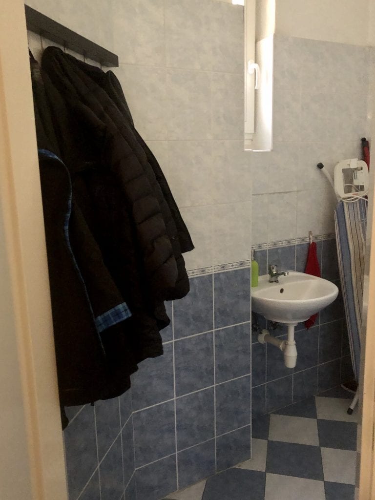
Because there’s no coat closet, the coats currently hang in the toilet bathroom!

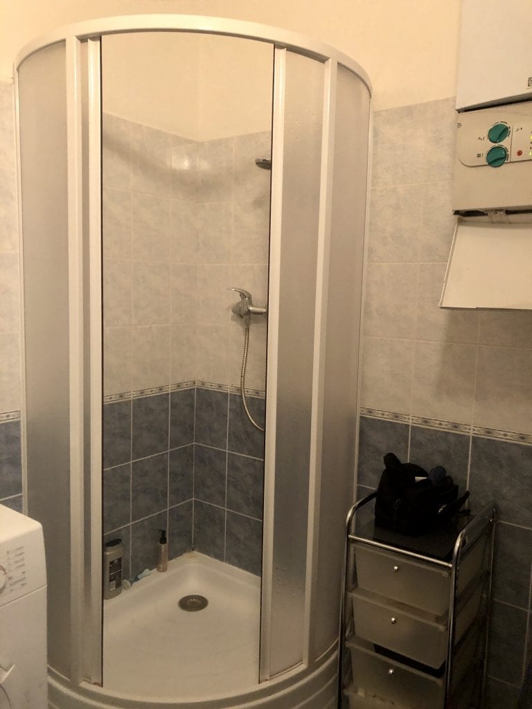
The other bathroom has a shower, bathtub, sink, and washing machine, along with the rest of our bathroom storage.
The vanity is hung at a perplexingly high height — I struggle to get my face in. We want to get a new vanity and hang it at a normal height. And I’d love to get a better trash can, get rid of the plastic hamper, and get some white bathroom mats that aren’t as harsh against the blue-and-white decor.

This is the entryway from the other side. As you can see, we need to work on the clutter.

From the entryway, you walk into the living room and see this before you. This photo gives you an idea of just how high the ceilings are — about 12 feet!

This is the view from sitting on the futon. You can see we got some navy seat cushions to replace the yellow-and-white striped cushions.
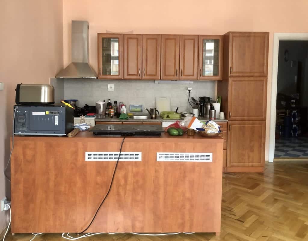
The kitchen, as viewed from the futon area…

The kitchen, as viewed from above the counter.
Charlie is a great cook and he needs a decent-sized kitchen. When he first moved in, the kitchen was only what you see above, minus the cabinet to the right. He added the cabinet as well as an island in front of the kitchen. The refrigerator and freezer are underneath the island.
Even with all this, it feels like everything is spilling out of the kitchen. The top of the stove is used for pan storage because we don’t use the electric burners on the stove — instead, there’s an induction stovetop on the island, and I’d love to figure out a way to hide the cord.

This set of doors might be my favorite feature in the apartment. I love how it’s a deep, glossy cutout before you go into the bedroom. (And how perfect is the little poof on the door handle? I got that with a handbag I bought in Mérida, Mexico!)
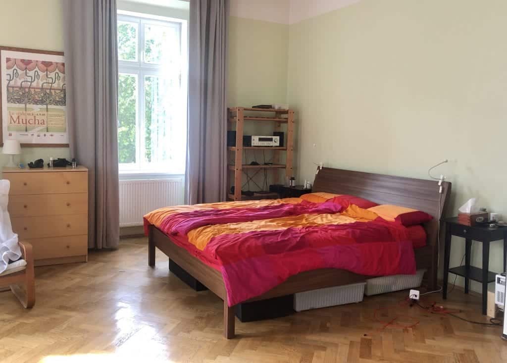
The bedroom is enormous. When you walk in, this is what you see to the right: a bed, two nightstands, some basic open shelving, and a plain wood dresser.


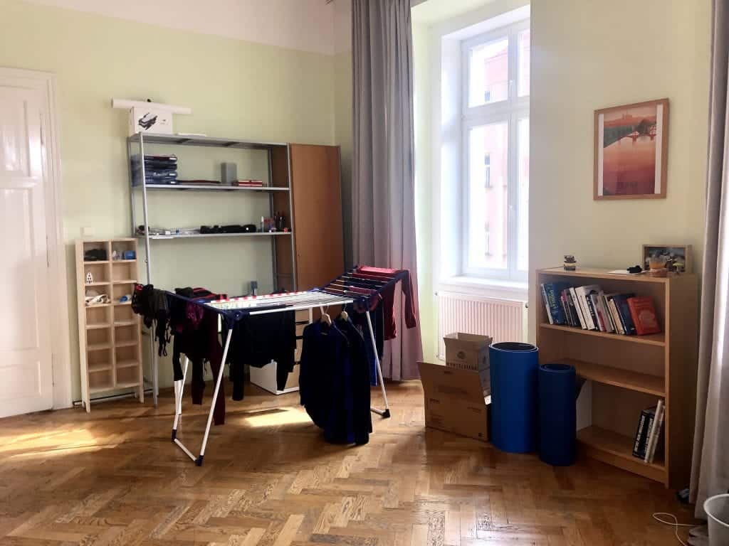
There’s a ton of space in here. You can see that this is where the two desks we used to use were — we don’t use them anymore. I would love for us to take them out altogether.
I love the idea of turning the corner in the photo above into a reading corner or den of some kind. A place to relax that isn’t in the living room. As much as I dislike open shelving, perhaps high quality open shelving filled with books or plants would be a good way to divide it. Maybe a folding screen. Apartment Therapy had some good ideas here.

Best of all, WE HAVE A TURRET!! An actual turret!!!!!
When I first met Charlie, he was using the turret as a laundry-drying room; this past spring, he decided to turn it into an actual office. That was a fantastic idea — it’s a great size for two desks apart from each other. And I convinced him to move the giant printer here from the living room.
I don’t love the idea of an office being in a bedroom — sleepy vibes in the office, work vibes when you’re trying to sleep, bad feng shui and all that — but this seems like the best way to work with what we have, and I like how it’s more separated from the sleeping area this way. And there are floor-to-ceiling curtains that we close at night.
Top Apartment Priorities
There is so much to do in the apartment that it will take a long time, done little by little. But we can knock out the top priorities quickly.
Decluttering and reorganizing
Far and away the biggest undertaking. I did tons upon tons of decluttering of my own before moving out of New York, and now I’m helping Charlie do the same.
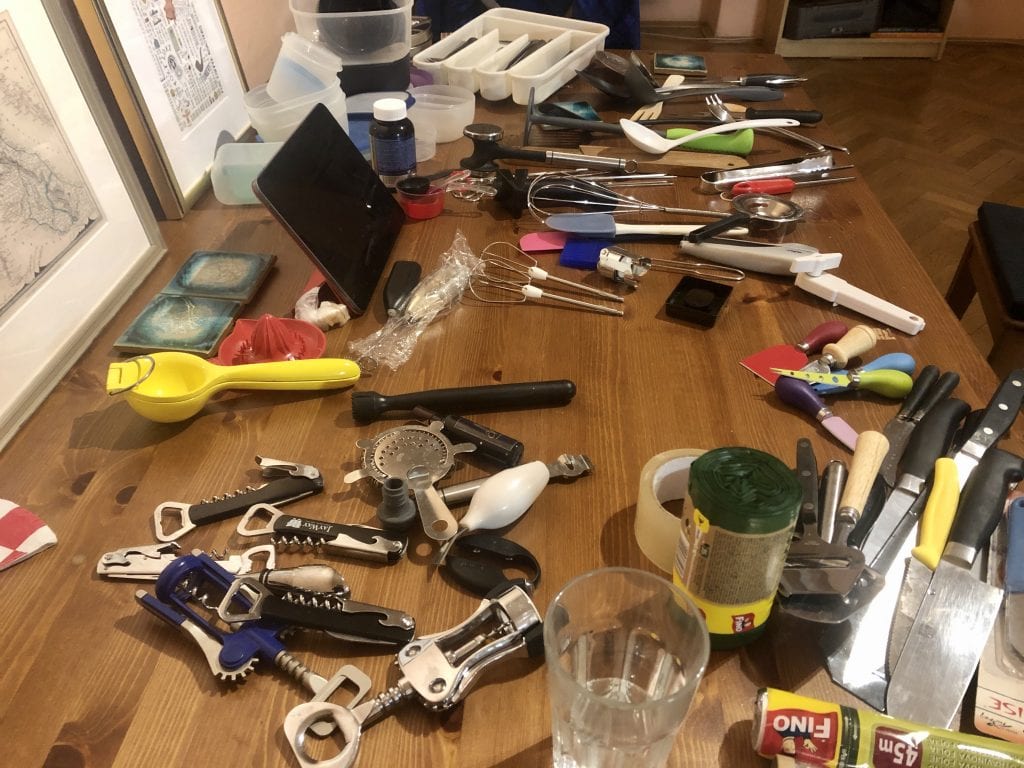
We’re off to a decent start. We’ve done decluttering of clothing and linens, taking back SO much storage space, and we’ve done most of the kitchen decluttering, throwing away so many rarely used and expired spices and sauces and paring the tools down to the essentials. It’s amazing how you can acquire three cheese slicers, two meat tenderizers, and seven corkscrews without noticing.
I can’t tell you how excited I was to take ski gear, beach towels, water shoes, and sunscreen, and put them in the “vacation box” that lives under the bed. So satisfying.
The toughest part will be decluttering all the office stuff — so many wires, USB chargers, piles of paper, and a giant desk setup that we don’t need.
Storage
With no closets in the house, there needs to be a place to store our things and hide the clutter. My New York apartment had FOUR closets — a coat closet, a living room closet, a walk-in bedroom closet, and a giant pantry in the kitchen. It was bliss. I love being able to hide stuff out of sight.
What we need are more portable closets, or wardrobes — and the only wardrobes are in the bedroom.
To combat this, one of our goals is to build a set of closets in the front entryway, using the highly customizable IKEA PAX system. You can make a PAX look super designer if you’re creative (this is my favorite example).
Right now I’m envisioning a three-unit closet: one to function as a coat closet, one to function as a cleaning supplies closet (including the full-sized mop, ironing board, and vacuum), and one for storage. I hope that’s enough; part of me worries we’ll need more.
We also need a way to figure out where to store the recycling bins, as even after decluttering, we have maxed out our kitchen space. They’re currently out in the open, which isn’t the prettiest thing to look at.
New couch
The current couch is a futon that Charlie bought in 2001. Fun fact: I knew about the futon before I even knew Charlie because Cailin has slept on it so many times!
Futons are not the most comfortable item to sit on. Nor sleep on. We agreed to replace it pretty quickly.

And so we bought a couch! It’s teal and modern and awesome! It’s by Bobochic Paris and it folds out into a queen-sized bed. Most convertible couches in Europe tend to be the kind that fold backward, having you sleep on the couch cushions, and I didn’t want that. This one folds out properly, just like my purple couch in New York, and has a real mattress inside.
Our next plan is to get throw pillows to put on top. I’m thinking a raspberry shade for two large pillows on the edges, and then we can have fun with magenta throw pillows. Or we might switch things up and go for mustard.
Guest comforts
There are a few things we needed to get to make guests more comfortable here: a mirror in the toilet bathroom, as that’s the only bathroom guests ever have to use; a trash can in the toilet bathroom; and a bench near the door so they have a comfortable place to sit and lace up their shoes. And of course, a place to hang their coats so they don’t have to drape them on the back of a dining chair.
Charlie didn’t think we needed a bench for the door, and I kept saying, “If we expect people to take off their shoes, we need to give them a place to do it comfortably.” Then a few days later his friend came over — and brought his shoes into the living room so he could tie them on while sitting on the futon! VINDICATION.
We went to IKEA and bought a long white bench that doubles as a shoe rack, a new trash can, and a sticky-backed mirror that cost us the equivalent of a dollar!
Painting
Right now, the living room is painted a salmon pink and the bedroom is painted a pale chartreuse. In both rooms, the paint stops about two feet before the ceiling, leaving a white banner around the room.
I think the best idea is to paint both rooms solid white, and go from there. They are huge rooms with very high ceilings, and anything else would be overpowering. Plus, white gives us the maximum decor options. Just seeing the new teal couch against the salmon walls has underscored that we need to get this fixed.
We’re going to hold off on this while COVID is surging, but it’s a top priority.
Lighting
In the living room, the light fixture contains three little lights pointing in different directions. One faces in the direction of the kitchen, one faces the dining table, and one faces the TV — so the entire couch area is shrouded in darkness during the evening. We definitely want to change the light fixture, but changing a fixture on a 12-foot ceiling without owning a ladder means we’ll need to get one or hire someone…and again, COVID.
For now, it might make sense to get a floor lamp for that corner of the room.
In the entryway, the light is so weak but that’s probably due to the quality of the bulb. We should get a better bulb and see how it works.
And we’d love a new light for the bedroom, which currently has a paper IKEA shade.
Shipping my belongings over
At this point in time, I have several pieces of furniture and all of my books in a storage unit outside New York City. The furniture includes my white bed, my white dresser, white side table, white and gold mini desk, gray and white striped swivel chair, and acorn TV console. All but the bed are from West Elm.
There are also two rugs — my big pink-and-purple Persian rug, which I ADORE to the moon and back, plus a small gray patterned rug. Additionally, I have an acorn Joybird chair with teal cushions that has been living at my sister’s apartment.
I would love to ship most of it over. (Not the bed, as the dimensions for beds in Europe are totally different.) But shipping furniture to Europe, as you’d imagine, is very expensive. On the low end, it would probably cost 16 months worth of storage.
My other belongings are at my mother’s house. I’m actually going to be working with a luggage shipping company to bring many of them over, and soon! My top priorities are linens and decor.

Our Design Plans
Everything is mid-century modern these days, and I do love everything mid-century modern. But I think I went overboard a bit in my New York apartment — everything was too matchy-matchy. I want the Prague apartment to be more eclectic, with a mixture of furniture that works well together but isn’t part of a matching set.
Coziness is a big priority, too. It’s going to be a rough winter with COVID this year, and we’re going to be spending our winter tucked inside from the cold, rather than heading to Mexico like the last two years. For that reason, I want our place to be all about warmth. Textures that you love to run your hands over. Blankets and pillows. Candles. All of the hygge, Danish style.
Additionally, I want the apartment decor to reflect our love of travel, but I don’t want it to be only travel. It would be VERY easy to cover the whole apartment with travel photos and maps and vintage travel posters — but that can get out of hand quickly. I want the apartment to be well-rounded.
I really enjoyed the white-gray-gold vibe in my New York bedroom, and I’m going to try to replicate that here.
I want to add decor to my side of the office — I want to have some inspirational women on the wall, Leslie Knope-style.
Oh, and plants! I know absolutely nothing about plants, but I’m ready to own some. A lot of my friends have gotten into houseplants lately and I want to be part of the fun.
And I am VERY excited to get into IKEA hacks!! I had no idea IKEA hacks existed until recently — people take basic IKEA pieces and design them into something fabulous and gorgeous. We are doing our first IKEA hack this weekend, adding gold hairpin legs to our new coffee table.
Adding legs, changing hardware, and painting pieces are easy ways to customize IKEA furniture. Just Google “IKEA hacks” or “IKEA dresser hacks” or “mid-century IKEA hacks” and within a few hours, you’ll be inspired to DIY your whole house!
I think a good easy hack to start with would be painting the two HEMNES nightstands white and changing the hardware to gold. Maybe adding some gold and white patterned removable wallpaper to the outside of the drawer itself.

Dream Future Plans
If you’re talking long-term and expensive plans, we definitely have some dreams. But being in a rental, it makes you wonder just how much is worth it. But being in a place where we’d like to stay for awhile, as well as being in a country where you can get work done for much cheaper than in the US, means it could be a possibility.
Here are two things we would love to do:
Redoing the tiles
The tiles in our entryway and bathrooms are pretty awful — they even have textured tiles on the walls. It’s a traditional Czech thing.
I was obsessed with the gorgeous tiles in Mexico, which brought a home to the next level. Portuguese azulejos, their signature blue and white tiles, are lovely, too.
I looked into replacing our existing tiles with high-quality tile stickers, so good that they look real and you can even mop them. Turns out those tile stickers are EXPENSIVE — as in it would cost several thousands of dollars just to cover the entryway. Eek.
If we wanted to retile the entryway and two bedrooms using fancy tiles for sale in the Czech Republic, it would probably cost around $1500 for tiles and labor. But that doesn’t include the wall tiles. With less fancy tiles, it would probably cost closer to $1100 for floor alone, maybe $1800 with the walls too.
It would be awesome, but it’s not a top priority.
Redoing the kitchen
Is it insane redoing a kitchen in a rental? Well, it would pretty much be entirely cosmetic, and we wouldn’t need new appliances, so perhaps we would be able to do some of it for cheap. I would LOVE to rip out the awful textured backsplash and put up something beautifully patterned.
We looked into painting the cabinets, but they’re all covered with a cheap plastic film that’s pulling apart from the wood. I feel at this point it might not be the worst thing to buy new cabinets, or maybe just cabinet doors. In white, of course. White kitchens are still in.
That’s another item for the future.
I’m excited to get started!
Right now I’ve been browsing like crazy, and it’s been a bit challenging that all of the sites are in Czech. (On the plus side, I have learned a lot of Czech words. Nábytek means furniture and zlata means gold!) And when they’re not Czech sites, it’s often very expensive to ship here, even from within Europe.
But there are some good ones! When I found West Wing, I nearly cried because it was basically West Elm, the style I love, but a bit cheaper and available in the Czech Republic. Fler is the Czech version of Etsy if you’re looking for something homemade. And I’m getting better at navigating Bonami, one of the major Czech home sites.
It’s going to be an adventure — and I can’t wait to see what it turns into.
How would you redecorate this apartment? I’d love to hear your thoughts!
The post Redecorating a Prague Apartment: These are the BEFORE photos! appeared first on Adventurous Kate.
from Adventurous Kate https://www.adventurouskate.com/redecorating-prague-apartment-before-photos/
VietNam Travel & Food Magazine Vina.com offers News✅ Travel info✅ Food Recipes✅ Photos✅Restaurant Guide at Vina.com https://vina.com/travel/nightlife/ https://vnfoodandtravelblog.blogspot.com/

0 Nhận xét